Cash Advance Solution
Product Design
At Equal Finance, we jointly aimed to make obtaining a cash advance as straightforward as possible while minimizing excessive interest fees. As a fintech company, our purpose is to use technology to promote financial well-being for all people.
Type:
Product Design
role:
Product Designer
Client:
EQL Finance
Year:
2022
Context
Revamping and streamlining the product to make it more user-friendly for those seeking additional funds.
Design Opportunity
Our target user is an individual in need of immediate cash but seeking to avoid excessive interest fees as a result of obtaining a cash advance.
Role
Product Designer
Leading the EQL Team to the revamp of the current experience.
Responsibilities
Conducting interviews, wireframes, usability testing with users, design iterations, prototyping and developer hand off.
Empathize
To kick off the project, I conducted research on our competitors and the features they provide. I interviewed stakeholders and surveyed users to gain a better understanding of their perspectives, motivations, and pain points.
My competitor research revealed that many apps are geared towards a specific demographic and are being used to supplement the user’s study. For example, Klover has a great model for advertisements and partnerships, while MoneyLion gives out money with a target percentage.
Based on my research, I identified the following features that could be added to our app:
A more user-friendly interface
More affordable fees
Additional features such as budgeting tools and investment advice
I am confident that these features will improve the user experience and make our app more competitive.
— Next, I identified features from other apps that could serve as inspiration and be helpful for our users.
Insights
The high-interest fees associated with loans and cash advances discourage users from utilizing these options.
Previous designs by the ISS team resulted in a low conversion rate from loan application due to lack of user-friendliness, leading to high drop-off rates among users.
Pain Points
Our current layout and user interface are causing significant user drop-off. We need to improve the design to create a more intuitive and engaging user experience that retains our users.
The user experience needs to be refined to better meet the needs of our users. Our assumptions from early product creation are no longer sufficient, and we need to conduct research to identify areas where we can make improvements.
The process for getting cash is currently too lengthy and cumbersome. We need to streamline the process and make it more user-friendly, so that users can quickly and easily access the cash they need.
User Interview & Analysis
I was able to gain valuable insights into the language learning experience through conducting user interviews.
Users are reluctant to use our lengthy cash advance process and are looking for a more streamlined flow.
The current process for getting a cash advance involves too many steps and creates a barrier to entry for our users.
The language we use in our product is confusing and full of jargon, which makes it difficult for users to understand how to use our service. We need to simplify our language to make it more accessible to everyone.
Ideation
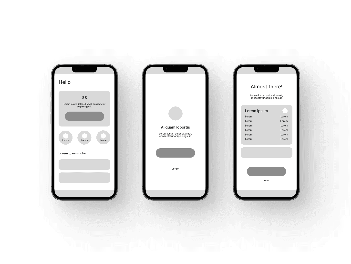
I generated solutions and devised a new user flow that prioritized a user-friendly experience for our users, informed by my research. I then created sketches, mid-fidelity wireframes, and usability tests. Finally, I created a Design System to ensure that the user experience was consistent across all platforms.
Journey
Onboarding Experience to the cash advance. This flow is designed to inform users of what they can expect during the process.
Cash Advance. Requesting your cash advance, and it’s worth noting that this process is integrated with the Plaid API, which securely captures your account information.
Payment. This section allows you to choose your preferred method of receiving the money.
Mid Fidelity
I did some sketches keeping in mind the user’s pain points and motivations to mid-fidelity screens, I started by laying out all the pages I needed to design for the journeys. I divided the design into sections for each element and focused on the details in my work.
Usability Testing
I conducted usability testing with participants over Zoom, each lasting about 30 minutes.
The objective of the test:
Observe if users can accomplish the specified task. If they made a mistake, can they recover?
Identify areas of the app that requires a change to improve user performance and satisfaction
With the provided feedback, I created revisions to fill the gap between my understanding of the users and what the users experienced.
Key Takeaways
After gathering feedback from my supervisor and project manager, and analyzing the results from our user testing, we progressed with the implementation of the redesigned product.
Design System
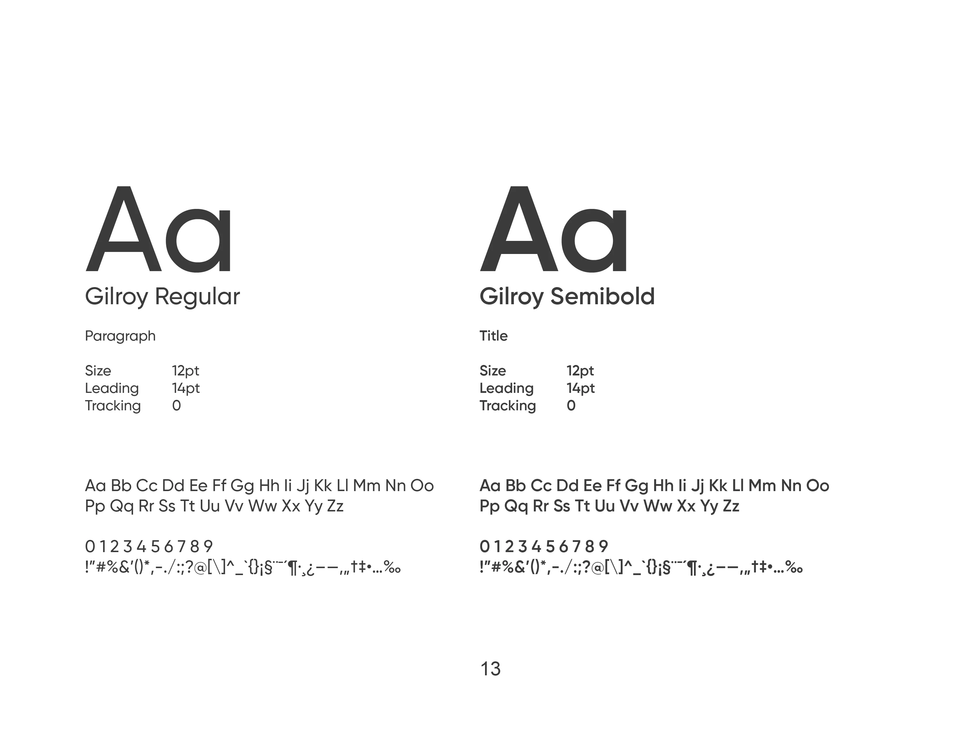
Chaeyoung Park and I developed a comprehensive design system, which was approved by the CTO and Product Manager and implemented throughout the entire product.

Final Solutions
Results
We successfully implemented and tested the minimum viable product (MVP) in a controlled beta environment.
My redesign led to a successful launch of the updated app with a 50% increase in conversion rates, as reported by PostHog analytics and positive feedback from management.
🌟 50% increase in conversion rate
🌟 50+ users tested
🌟 100% task completion rate
🌟 4/5+ user satisfaction rating
Reflection
Through working on the design of the loan process for Equal Finance, I developed valuable skills and gained confidence in my abilities as a designer. This was my first opportunity to create a complete product from start to finish within the Equal Finance application, and it was a rewarding experience.
As the sole product designer on this project, I took full responsibility for my design iterations, process, and feature presentations, honing my skills and gaining valuable experience in end-to-end product development within the Equal Finance application.
I gained valuable experience in navigating the complexities of a start-up environment, where I was able to observe firsthand the integration of design and engineering, and how it plays a crucial role in delivering a successful product within a fast-paced and dynamic setting.
References
Chaeyoung Park, Nestor Koylyak, Paul Pierre
Checkout the live product — www.eqlfinance.com


