Quoting Experience
Product Design
I was thrilled to work on a high-impact project for Cover Trip, a company that is striving to revolutionize the way people purchase travel insurance through its partnership with SquareMouth. My role in the project was to design a user-friendly and engaging quoting experience for both desktop and mobile platforms.
TYPE:
Product Design
ROLE:
Product Designer
Client:
Cover Trip / OXY
Year:
2021
Role
Product Designer
My main objective was to create and design a seamless and enjoyable experience for users looking to get travel insurance.
Responsibilities
I was responsible for conducting research, creating designs, and generating prototypes. The end result is a live product that has received positive feedback from users.
Project Goals
To decrease the abandonment rate during quote inquiries, it is essential for customers to take certain measures.
The aim is to provide clients with a more advanced and innovative experience while they inquire about or purchase travel insurance.
Empathize
The project was initiated by researching our competitors and their offered features, followed by conducting surveys and interviews with stakeholders to gain a comprehensive understanding of their viewpoints. Lastly, insights into the motivations and pain points of our users were sought.
During my research on Cover Trip’s competitors, I analyzed both direct and indirect competitors. I discovered that numerous websites target a particular demographic and are utilized as a complement to users’ studies.
I prioritized questions that have the potential to address the design opportunity.
What strategies can we implement to decrease the rate at which users abandon the quote inquiry process?
How might we enhance the user journey and eliminate friction during the quoting process for travel insurance?
How might we enhance the user experience for inquiring or purchasing travel insurance to meet the client’s goal of delivering a cutting-edge experience?
Qualitative Findings Summary
Many competing travel insurance websites have a step-by-step process for entering personal information, destination, and travel details before requiring users to sign up. However, some websites stand out by offering a more seamless and straightforward experience that allows users to complete the entire process without any significant roadblocks.
Insights
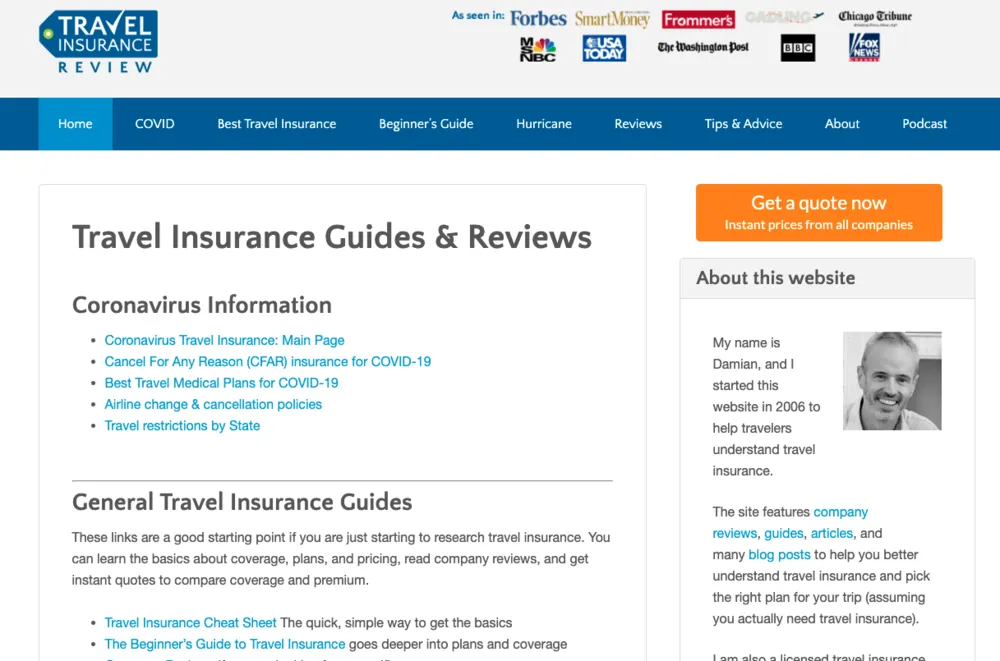
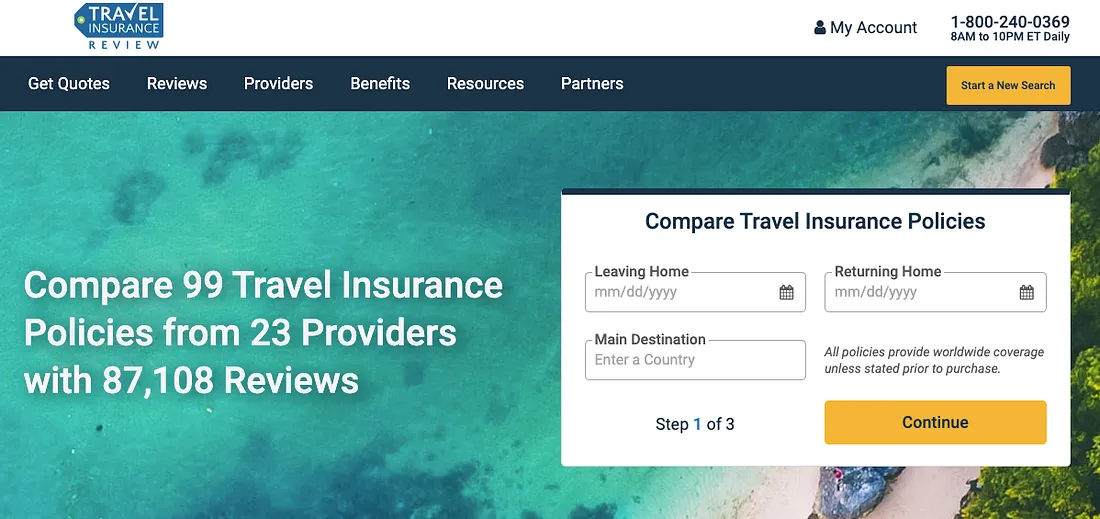
Previously named Travel Insurance Review and in a direct partnership with SquareMouth, the website now enables new customers to obtain quotes
Pain Points
The website’s visual appearance and user interface seem old-fashioned and do not align with modern design trends and techniques. The website may benefit from a revamp to enhance its visual appeal and make it more user-friendly for visitors of all ages.
Requiring users to sign up with their email address to access complete information is a potential drop off for some visitors.
User Interviews & Analysis
Through conducting user interviews, I was able to delve deeper into the language learning experience and gain a comprehensive understanding of the challenges and opportunities learners face.
The insights gleaned from the interviews provided me with invaluable information that could be used to create solutions tailored to the learners’ needs and preferences.
Ideation
As part of the design process’s creative stage, I brainstormed solutions and created a new user flow that prioritized a user-friendly experience informed by my research. Subsequently, I created sketches, mid-fidelity wireframes, performed usability testing, and utilized a comprehensive design system provided by Oxy.
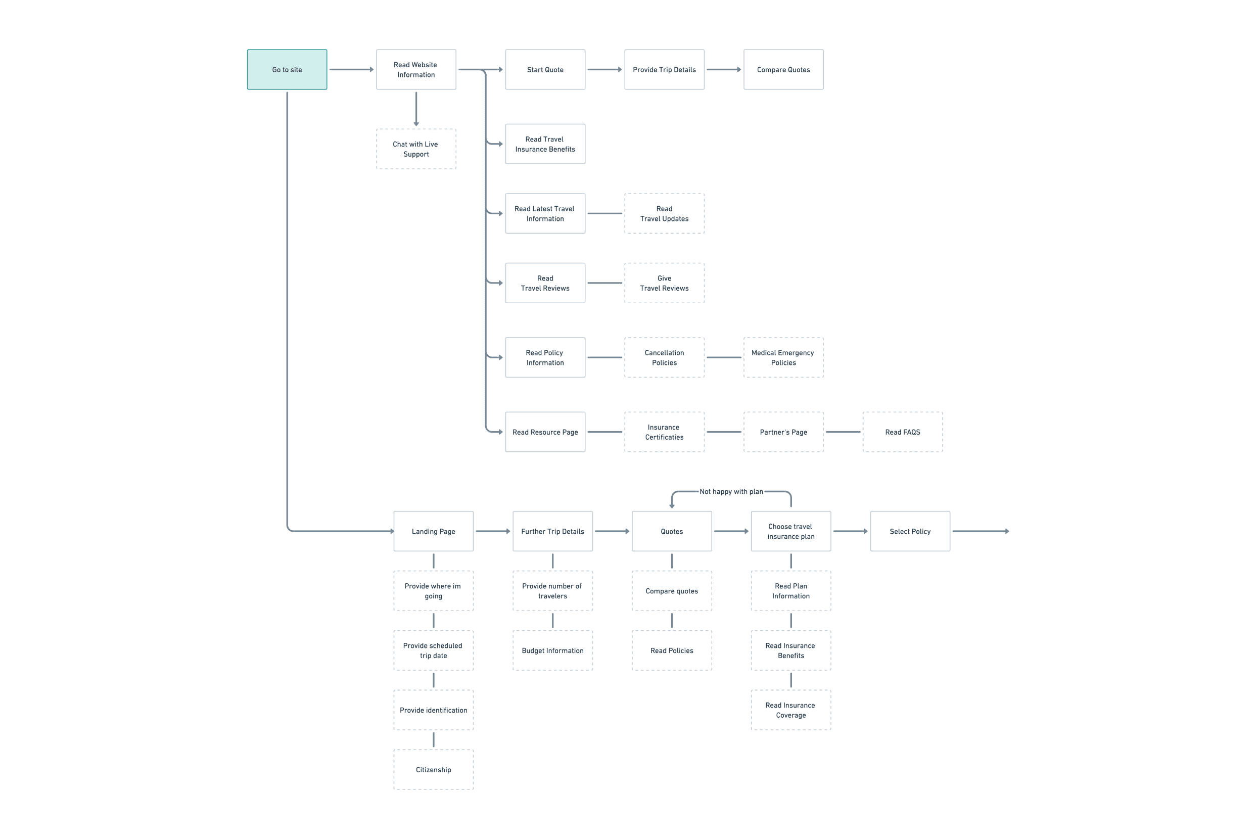
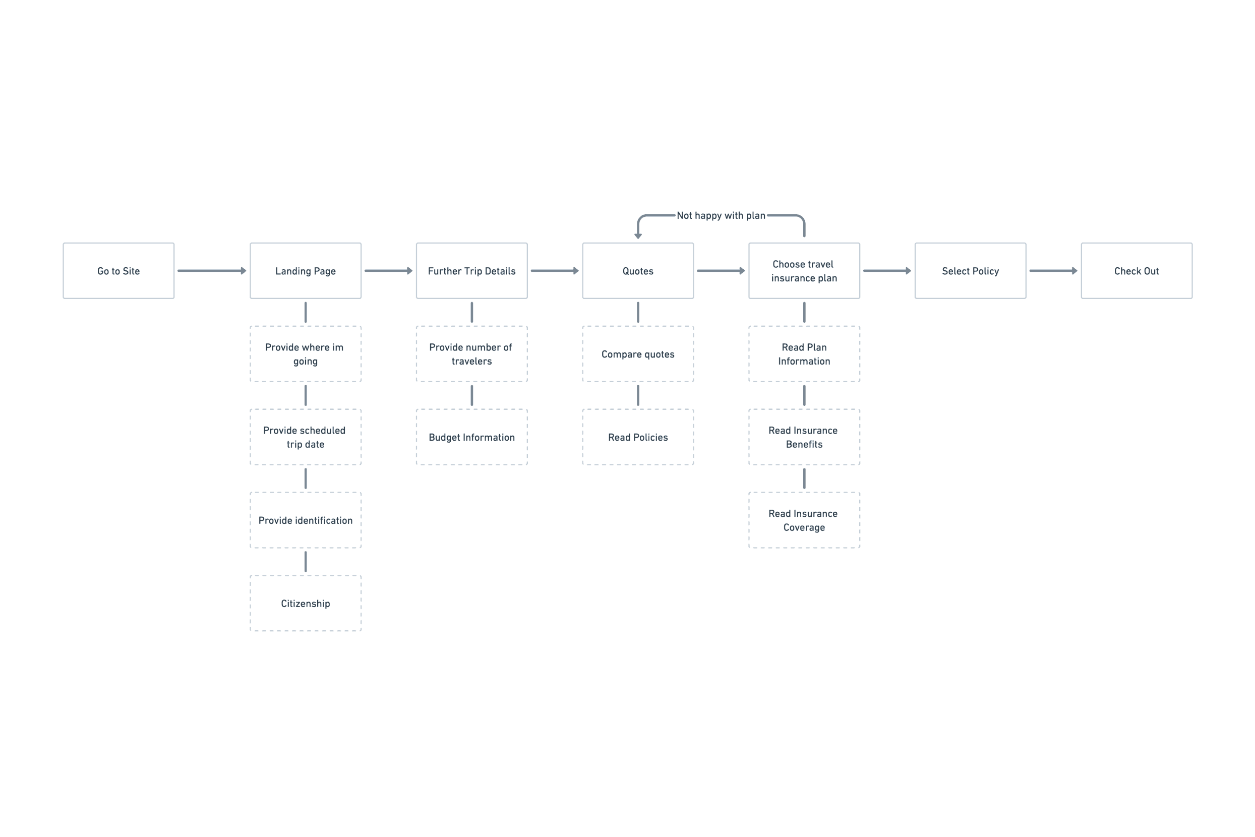
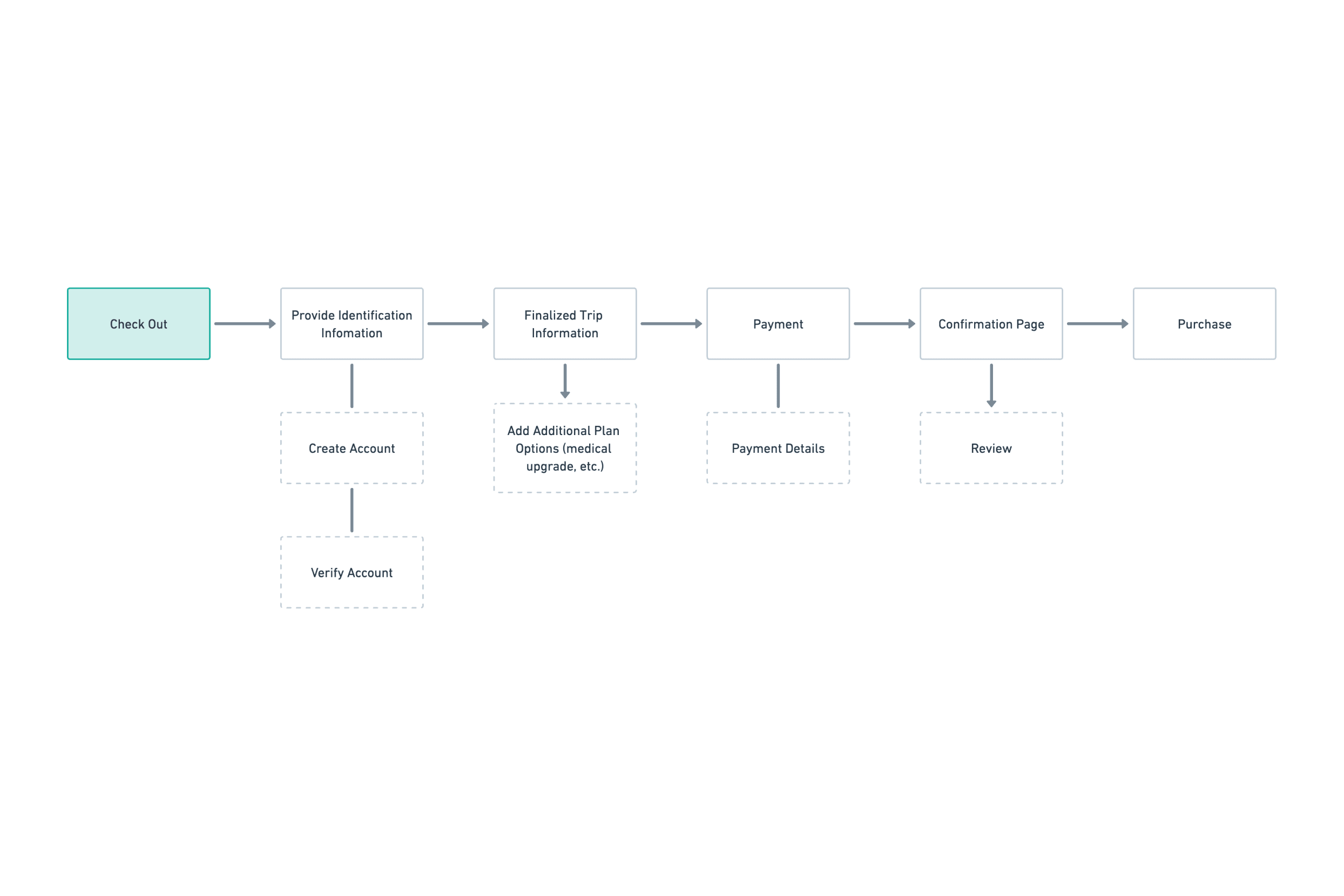
Ensuring a seamless experience was crucial. It was imperative to streamline the user journey, starting from inputting the destination, budget, and number of travelers, all the way to the checkout process.
Userflows
Journey
For travelers seeking immediate insurance coverage, time is of the essence.
For travelers conducting research and comparing quotes, it’s important to have access to comprehensive information and an easy-to-use platform.
A seamless checkout process requires a streamlined user flow, optimized form, multiple payment options, clear instructions, and mobile-friendliness.
Wireframes
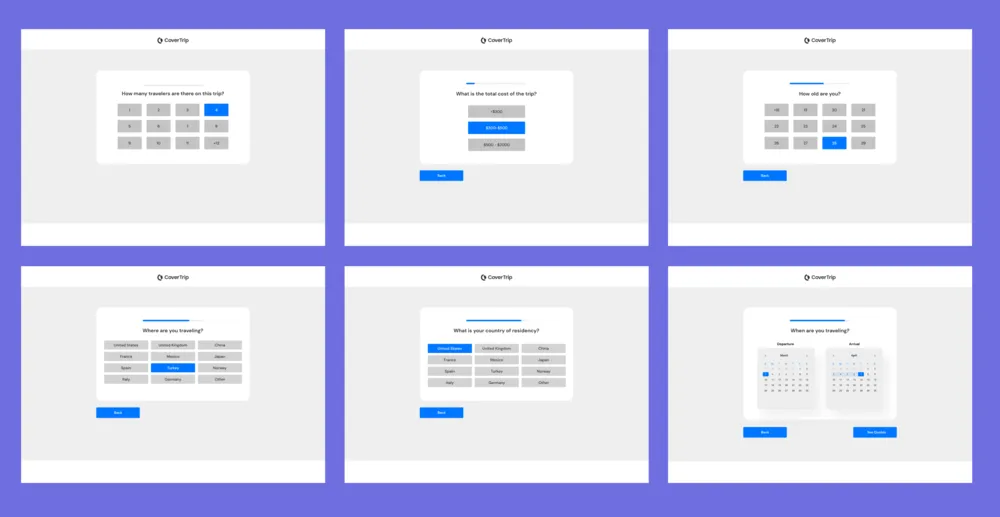
This is the first version of the wireframes, where each step is clearly laid out, and the user can simply tap the corresponding action to proceed to the next step.
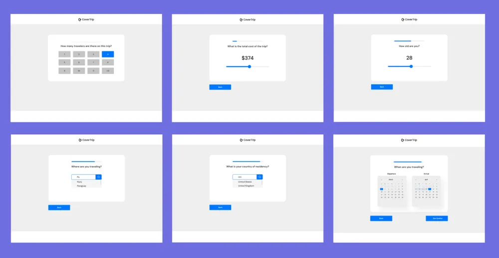
Version two of the wireframes includes some updates, such as the use of sliders for selecting price and age range. Additionally, an autofill feature has been added to allow for a quicker input of destination information.

The CEO’s request for the comparison tool is to provide users with the ability to compare multiple insurance quotes simultaneously.
The tool will allow users to select up to three quotes and display them side-by-side for easy comparison. This will enable users to make informed decisions based on a range of factors, including coverage details, pricing, and any additional benefits offered by each policy. By providing this feature, the company aims to differentiate itself from competitors and offer a more comprehensive and user-friendly experience for customers.
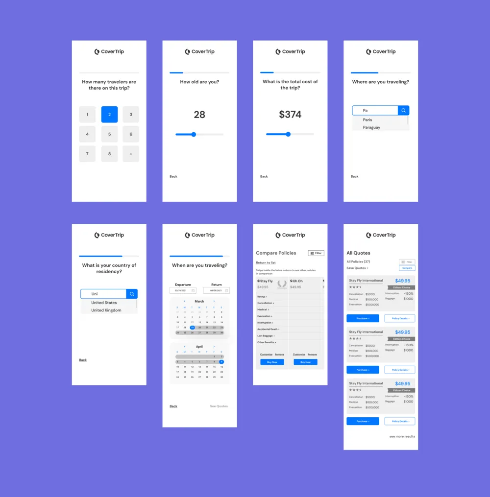
I held off on creating the mobile designs until I received approval from both the Creative Director and the CEO regarding the previous iteration. This allowed me to ensure that the mobile designs would align with the overall vision and goals of the project.
Design System
Oxy provided the design system and typography, which I utilized to create aesthetically pleasing designs that were consistent with the established system.

Final Solutions


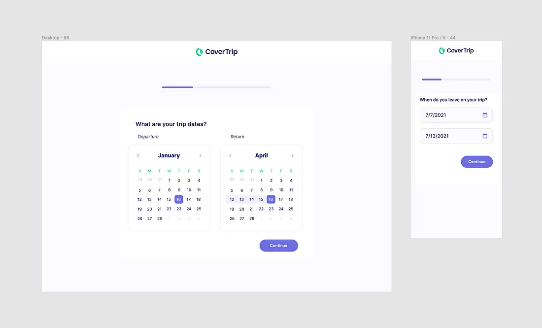
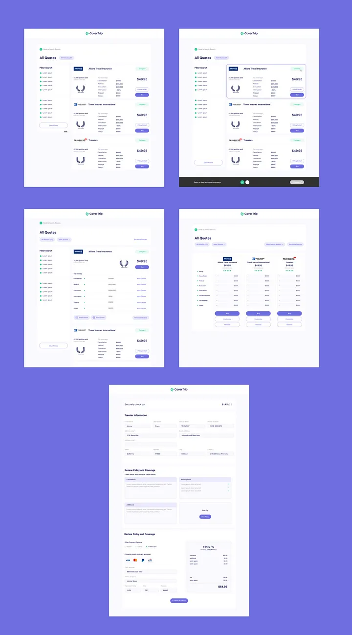
Outcomes
The redesign of the quoting tool was a success, incorporating a modern typeface and color scheme that was well-received and improved the user experience. After implementing the new quoting process, both the CEO and Creative Director provided positive feedback, and our partner, SquareMouth, also approved of the changes. This was a significant improvement from the initial design, resulting in a more inviting and user-friendly experience.
Check out the live product — www.covertrip.com
References — Jamison Hill, Anthony Ferrera, Damian T.

